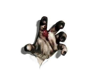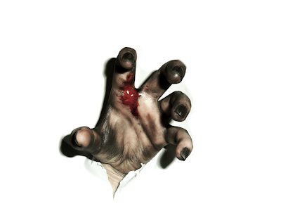
 From top to bottom: The finished version, first photo manipulation of hand, the second version with the majority of the blue now removed, and the final hand version cleaned up.
I decided on a saturated colour scheme similar to The Last Exorcism poster (see last picture). The red I didn't want to stand out too brightly, but add a sense of gore to poster.
The tagline I wanted small too, which seems to be the 'latest' fashion in movie posters.
The font used on the bottom is named SteelTongs and can be found here:
http://www.dafont.com/font.php?file=steeltongs&page=1&nb_ppp_old=10&text=abc&nb_ppp=10&psize=m&classt=alpha
The font for 'the end' is called Living Hell and can be found here:
http://www.dafont.com/living-hell.font?text=THE+END&psize=l


No comments:
Post a Comment